# [Bootstrap(v3.2.0) Cheat Sheet](https://github.com/ufologist/bootstrap-cheat-sheet)
*v0.1.0 2014-8-15 by [Sun](https://github.com/ufologist)*
Bootstrap的文档非常详尽, 每个组件每个示例都能够方便地在日常开发中快速使用, 真心感谢Bootstrap给我们提供一切, 切实地提高了我们的工作效率.
建议初学者一字不落地将文档看一遍, 上手之后, 其实我们使用频率最高的就是某些组件具体的HTML结构和CSS class, 这些东西如果能够背下来, 必定会让你的开发效率更上一层楼.
但我记忆力一直不咋的, 每次使用过一个组件后, 下次又得参看文档, 每天不停地打开Bootstrap, 翻来覆去地CTRL + F去找这些组件的使用方法, 并确认Bootstrap是否已经有实现了. 这些东西分散在文档中(Getting started, CSS, Components, JavaScript), 找寻时详尽的文档反而变成了效率的绊脚石.
其实我需要的是一份简洁的列表, 告诉我Bootstrap实现了哪些东西, 大概涉及到哪些CSS class, 以方便我快速的应用, 将Bootstrap提供的一切都用起来(榨干框架是我们的宗旨), 不重复造轮子, 体现出框架的价值.
也有小伙伴遇到了同样的问题并打造出了纸质版的[Bootstrap Cheat Sheets](http://www.bootstrapcheatsheets.com/about/), 但有些列表不够详尽, 或者版本没有和Bootstrap同步, 反正就是没有找到我想要的东西, 因此我自己做了一份markdown版的, 在Sublime Text中可以非常方便的定位大纲内容, 相当的easy!
如果你在使用过程中有任何意见建议, 欢迎[fork](https://github.com/ufologist/bootstrap-cheat-sheet)出自己的版本或者提出[issue](https://github.com/ufologist/bootstrap-cheat-sheet/issues/new).
**推荐的使用方法**
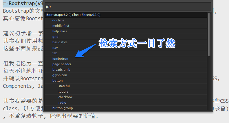
将[README.md](https://github.com/ufologist/bootstrap-cheat-sheet/raw/master/README.md)下载到电脑上, 在Sublime Text中打开(Goto Symbol), 效果如下:
附赠非常实用的[Bootstrap页面模版](http://ufologist.github.io/bootstrap-cheat-sheet/bootstrap-template.html), [Bootstrap示例集合](http://ufologist.github.io/bootstrap-cheat-sheet/bootstrap-examples.html), [Bootstrap网页模版](http://ufologist.github.io/bootstrap-cheat-sheet/bootstrap-site-template.html), 让我们可以更快的找到想要的东西.
## doctype
<!DOCTYPE html>
<html lang="en"></html>
## mobile first
<meta name="viewport" content="width=device-width, initial-scale=1">
## help class
text-left text-lowercase text-primary bg-primary
text-center text-uppercase text-success bg-success
text-right text-capitalize text-info bg-info
text-justify text-warning bg-warning
text-nowrap text-danger bg-danger
text-muted
text-hide
sr-only.sr-only-focusable
pull-left pull-right clearfix
center-block
show hidden
span.caret
<button type="button" class="close" data-dismiss="alert"><span aria-hidden="true">&times;</span><span class="sr-only">Close</span></button>
## grid
xs sm md lg
Media queries
/* Extra small devices (phones, less than 768px) */
/* No media query since this is the default in Bootstrap */
/* Small devices (tablets, 768px and up) */
@media (min-width: @screen-sm-min) {}
/* Medium devices (desktops, 992px and up) */
@media (min-width: @screen-md-min) {}
/* Large devices (large desktops, 1200px and up) */
@media (min-width: @screen-lg-min) {}
container container-fluid
col-*-*
col-*-offset-*
col-*-push-* col-*-pull-*
visible-*-* hidden-*
visible-print-* hidden-print
## basic style
h1 .h1 small .small
body font-size: 14px; line-height: 1.428
p margin-bottom: 10px(half line-height)
.lead
mark
del s
ins u
small strong em
code kbd pre var samp
abbr .initialism
address
blockquote footer .blockquote-reverse
ul ol list-unstyled list-inline
dl .dl-horizontal
## nav
ul.nav.nav-tabs nav-pills nav-stacked nav-justified
navbar navbar-default>container>navbar-header>navbar-toggle+navbar-brand
navbar-fixed-top >collapse navbar-collapse>nav navbar-nav
navbar-fixed-bottom >navbar-form
navbar-static-top >navbar-btn
navbar-inverse >navbar-text navbar-link
>navbar-left navbar-right
## tab
ul.nav.nav-tabs>li.active>a[href="#home" data-toggle="tab"]
.tab-content>.tab-pane.fade.active#home
## jumbotron
.jumbotron>h1
## page header
.page-header>h1
## breadcrumb
ol.breadcrumb
## glyphicon
span.glyphicon.glyphicon-*
## button
<button> <a> <input>
btn btn-default btn-xs btn-block active
btn-primary btn-sm disabled .disabled
btn-success btn-lg
btn-info
btn-warning
btn-danger
btn-link
### stateful
<button type="button" id="example-btn" data-loading-text="Loading..." class="btn btn-primary">submit</button>
$('#example-btn').click(function() {
var btn = $(this);
btn.button('loading');
// btn.button('complete'); // data-complete-text="html"
$.ajax('...').always(function() {
btn.button('reset');
});
});
### toggle
<button type="button" class="btn btn-primary" data-toggle="button">Single toggle</button>
### checkbox
<div class="btn-group" data-toggle="buttons">
<label class="btn btn-primary active">
<input type="checkbox" checked>Option 1 (pre-checked)
</label>
<label class="btn btn-primary">
<input type="checkbox">Option 2
</label>
<label class="btn btn-primary">
<input type="checkbox">Option 3
</label>
</div>
### radio
<div class="btn-group" data-toggle="buttons">
<label class="btn btn-primary active">
<input type="radio" name="options" checked>Option 1 (preselected)
</label>
<label class="btn btn-primary">
<input type="radio" name="options">Option 2
</label>
<label class="btn btn-primary">
<input type="radio" name="options">Option 3
</label>
</div>
## button group
div.btn-group>button btn-group-xs btn-group-sm btn-group-lg
div.btn-group>ul.dropdown-menu
div.btn-toolbar>div.btn-group
btn-group-vertical
.btn-group.btn-group-justified
## img
img.img-responsive
.img-rounded.img-circle.img-thumbnail
## table
table .table .table-striped .table-bordered .table-hover .table-condensed
tr.active td.success.info.warning.danger
div.table-responsive
## form
form .form-inline .form-horizontal
.form-group .has-success/warning/error .has-feedback .form-control-feedback .form-control
.checkbox>label>input:checkbox radio
label.checkbox-inline radio-inline
.form-control-static
disabled .disabled readonly
.input-sm .input-lg
.form-group-sm .form-group-lg
.help-block
## input group
input-group input-group-lg input-group-sm
span.input-group-addon
span.input-group-btn>button
## label/badge/alert
span.label.label-default
label-primary
label-success
label-info
label-warning
label-danger
span.badge
.alert.alert-success>strong
alert-info
alert-warning
alert-danger
.fade.in
a.alert-link
## panel
.panel.panel-default>.panel-heading>.panel-title
panel-primary>.panel-body
panel-success>.panel-footer
panel-info >table.table
panel-warning
panel-danger
## collapse/accordion
.collapse
.collapse.in
.collapsing
<button type="button" class="btn btn-default" data-toggle="collapse" data-target="#demo">simple collapsible</button>
<div id="demo" class="collapse in">collapse content</div>
<div class="panel-group" id="accordion">
<div class="panel panel-default">
<div class="panel-heading">
<h4 class="panel-title">
<a data-toggle="collapse" data-parent="#accordion" href="#collapse1">Collapsible Group Item #1</a>
</h4>
</div>
<div id="collapse1" class="panel-collapse collapse in">
<div class="panel-body"></div>
</div>
</div>
</div>
## list group
ul.list-group>.list-group-item>span.badge
.list-group>a.list-group-item.active.disabled>h4.list-group-item-heading
p.list-group-item-text
list-group-item-success
list-group-item-info
list-group-item-warning
list-group-item-danger
## thumbnail
a.thumbnail>img
.thumbnail>img+.caption
## media object
.media>a.pull-left>img
.media-body>.media-heading
.media
ul.media-list>li.media
## pagination
ul.pagination pagination-lg pagination-sm
li.active.disabled
ul.pager
li.previous li.next
## progress bar
progress>progress-bar[aria-valuenow="0"]
progress-bar-success
progress-bar-info
progress-bar-warning
progress-bar-danger
progress-bar-striped.active
## embed
.embed-responsive.embed-responsive-16by9>iframe.embed-responsive-item
.embed-responsive-4by3
## well
.well.well-lg
.well-sm
## dropdown
dropdown dropup
dropdown-toggle
ul.dropdown-menu dropdown-menu-right
li.active.disabled
li.dropdown-header divider
## modal
[data-toggle="modal" data-target="#myModal"]
.modal-backdrop.fade.in
.modal.fade
.modal-dialog.modal-sm.modal-lg
.modal-content
.modal-header
.modal-body
.modal-footer
## tooltip
[data-toggle="tooltip" data-placement="left" data-original-title="Tooltip on left"]
.tooltip.fade.top.left.bottom.right.in>.tooltip-arrow+.tooltip-inner>{Tooltip on left}
## popover
[data-toggle="popover" title="popover title" data-content="popover content"]
.popover.top>.arrow+.popover-title+.popover-content
## carousel
<div id="carousel1" class="carousel slide" data-ride="carousel" data-interval="false">
<!-- Indicators -->
<ol class="carousel-indicators">
<li data-target="#carousel1" data-slide-to="0" class="active"></li>
<li data-target="#carousel1" data-slide-to="1"></li>
</ol>
<!-- Wrapper for slides -->
<div class="carousel-inner">
<div class="item active">
<img src="http://dummyimage.com/600x400" class="center-block" alt="image">
<div class="carousel-caption">
<h3>First slide label</h3>
<p>Nulla vitae elit libero.</p>
</div>
</div>
<div class="item">
<img src="http://dummyimage.com/600x400" class="center-block" alt="image">
<div class="carousel-caption">.carousel-caption</div>
</div>
</div>
<!-- Controls -->
<a class="left carousel-control" href="#carousel1" role="button" data-slide="prev"><span class="glyphicon glyphicon-chevron-left"></span></a>
<a class="right carousel-control" href="#carousel1" role="button" data-slide="next"><span class="glyphicon glyphicon-chevron-right"></span></a>
</div>
## scrollspy
<body data-spy="scroll" data-target=".navbar-example">
## affix
<div data-spy="affix" data-offset-top="60" data-offset-bottom="200">